
A staffing request without data turns into the same meeting. The team lead says the phones are out of control. The director remembers walking past last Tuesday and seeing two people chatting. Both are describing real moments, neither has the month, and the decision goes to whoever tells the better story. Most of the time that storyteller is the budget.
Your PBX has been keeping the evidence the whole time. Each offered, answered, missed, and abandoned call sits in the CDR history with a timestamp. The work is shaping six months of it into a trend pack a non-telecom executive can absorb in five minutes. The sections below walk through the pack we build.
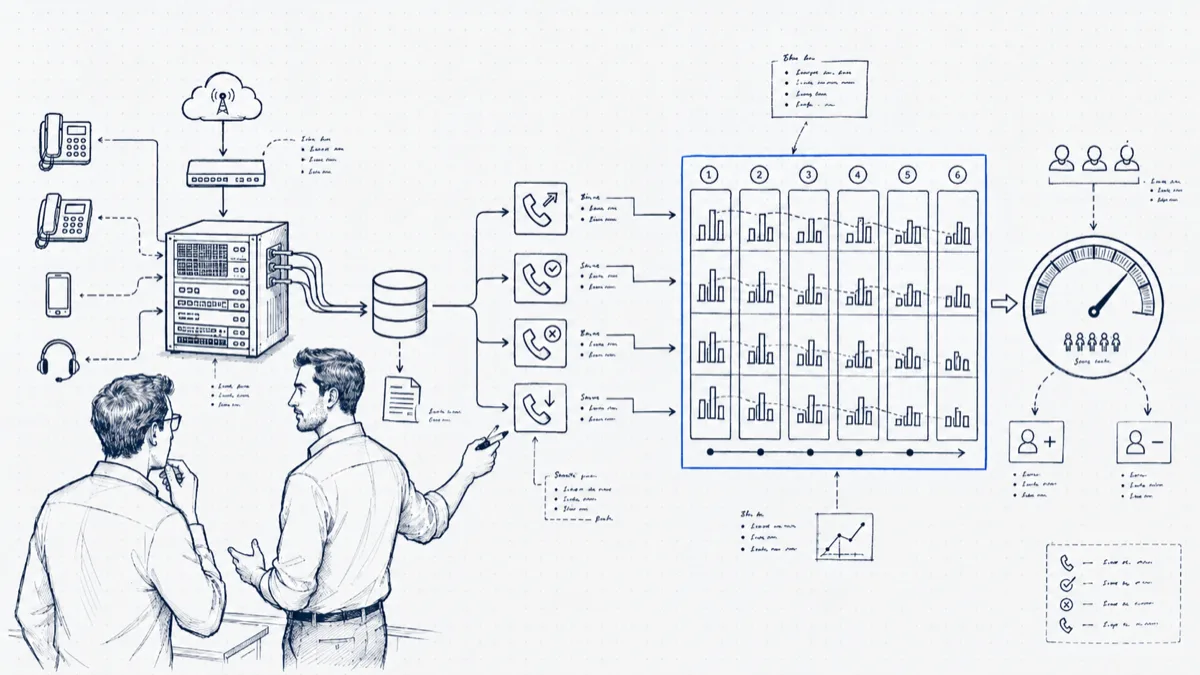
The trend pack: six numbers, one value per month
Resist the urge to export the whole CDR table. Six series, each one a single number per month, carry the whole argument. Pull them from the same source each month and write the definitions down (whether offered includes internal calls, the point at which a queue exit counts as abandoned) so that October’s numbers mean the same thing March’s did. A trend pack dies the first time someone catches two months counted two different ways.
Offered calls. The full count of calls that arrived, answered or not. This is your demand curve, and odds are leadership has not seen the line before. Headcount discussions change tone the first time someone shows demand up 22 percent over six months against a flat team.
Answer rate. Answered divided by offered. The cleanest single health metric, and the one to put on the first slide.
Abandon rate. Callers who hung up in queue. This is demand you attracted and then lost; for a sales line it converts straight to money.
Average wait to answer. This one tracks caller pain. The trend carries more information than the absolute number: 18 seconds drifting to 47 over four months is a story even without a benchmark.
Busiest-hour heatmap. Hour-of-day by day-of-week, offered calls in each cell. One picture replaces a thousand words of “it gets crazy sometimes.” Monthly totals flatten the day into mush; the heatmap shows the wall of calls at 10 a.m., and it decides whether your ask is headcount or schedule.
Handled per agent. Total answered divided by people on phones. If offered calls rose 22 percent and handled-per-agent rose with it, your team absorbed the growth and is telling you the tank is empty. This is also your defense against “just work harder”: the number shows they already did.
Seasonality: month-over-month lies to seasonal businesses
A tax practice comparing March to February learns nothing except that tax season exists. If your demand has a season, compare each month to the same month last year, and present both views: month-over-month for the recent slope, year-over-year for honest growth. “October offered calls are up 31 percent over last October” survives the seasonality objection that kills “calls are up this quarter.” This is also the strongest reason to start collecting call history before you need it; you cannot build last year’s record after the fact.
From call load to headcount, without an Erlang table
Two inputs size a phone team to the nearest person, with no queueing theory required: the busy hour, and average handle time measured as talk plus after-call work.
Worked example. The heatmap says the busy hour is Tuesday 10:00 with 42 offered calls. Average handle time, including wrap-up, runs 4.5 minutes. That hour therefore contains 42 × 4.5 = 189 minutes of work inside a 60-minute window, which is 3.2 people busy for the full hour with zero gaps, zero breaks, and callers arriving on an even schedule. Calls do not arrive on a schedule; they clump. A practical buffer is 25 to 30 percent over the raw minimum, which lands at 4 people on phones during that hour. If the schedule shows 3 during the Tuesday peak, the abandon rate spike at 10:30 stops being a mystery, and your trend pack has explained it without a single formula on the slide.
Run the same arithmetic on next year’s projected busy hour (this year’s busy hour times your year-over-year growth) and you have a defensible forecast: at +20 percent, Tuesday 10:00 becomes 50 calls and 225 minutes, and the requirement moves from 4 toward 5.
Presenting it: one chart, one ask
Leadership meetings reward compression. Lead with a single chart: offered calls and answer rate, six months, two lines. Demand climbing, answer rate sliding is an argument complete in itself. Then one sentence of arithmetic (“our Tuesday peak now carries 189 minutes of call work per hour; three people can carry 135”) and one specific ask: “one agent, Tuesday through Thursday, 9 to 1.” Executives approve asks tied to a visible peak and defer vague “we need more people” requests to next quarter. Leave the other four metrics in an appendix for the questions.
The counter-case: when the data says you don’t need anyone
Run the same pack straight and some months it argues against you, which is what makes it credible the months it argues for you. The classic pattern: answer rate is fine at 9 a.m., fine at 3 p.m., and falls off a cliff from 12:00 to 13:30, because the lunch rotation puts four of six agents away at once while callers, who also use their lunch break to phone, are peaking. Offered calls per day: flat. Total daily capacity: sufficient. A new hire would fix this by accident and waste most of their hours. Staggering lunches into three waves fixes it for free. We have watched a midday answer-rate hole of 15 points close inside a week on a schedule change alone. Walking into a budget meeting and not asking for money, because the trend pack showed a scheduling fix, buys a credibility that pays out the next time you do ask.
Wrapping up
All of this runs on data your phone system already produces. PBXDom builds the pack for you from the CDR stream of your Cisco, Avaya, Mitel, Panasonic, 3CX, or FreePBX system: offered, answered, abandoned, wait times, hourly heatmaps, and per-agent counts, kept month over month and year over year from the day the collector starts, with live dashboards for the daily view. Fourteen days of free trial is enough to put the first real chart in front of your director; onboarding takes about 15 minutes.