
PBXDom comes with 9 different scaled-up charts to present information. To get to the charts page, click on the Chart button on the top-left.
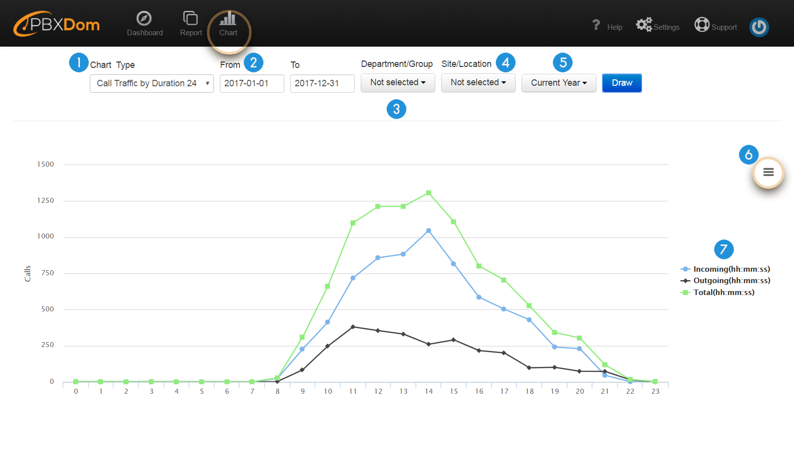
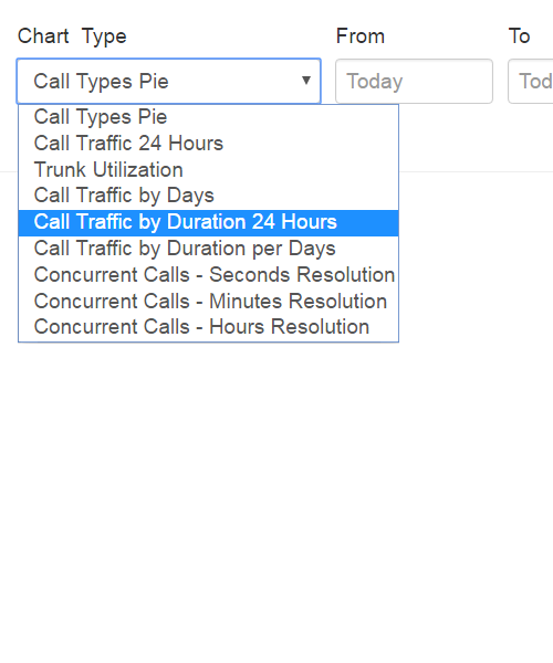
1. Chart Type: to view a list of all the charts available on PBXDom, you can click on the down-arrow icon to the right of the Chart Type menu. Then a menu list appears.
2. From/To: user can limit the information being displayed by a chart by defining a time range. Click on the fields From and To and specify the range.
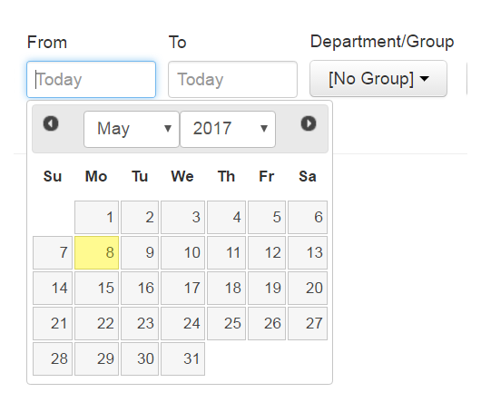
Note: to speed up the chart creation process, try to define smaller ranges.
3. Department/Group: here, you can define the exact department or group in your company or organization which you want a chart to be limited to.
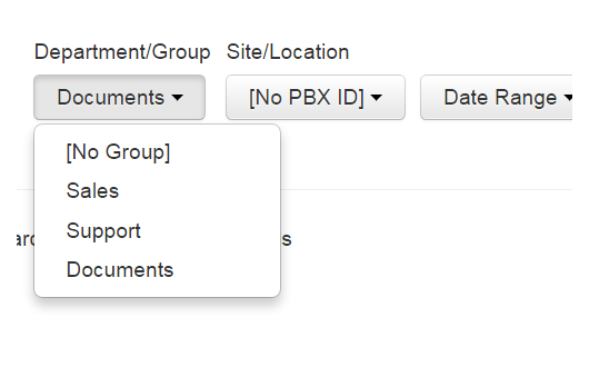
Example: assume that you have Sales or Support Department in your company, and you might be only interested in limiting a chart or graph to display information from one of the departments.
4. Site/Location: users can connect many PBXes to their account on PBXDom website and receive information from different locations. A chart can be limited to show information from a certain PBX or location.
5. Date Range: a list of predefined time ranges. For example, we can limit a chart to Today, Yesterday, or Current Week, Current Month, Current Year, and so on.

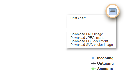
6. Print/Export: a menu list for printing and exporting the charts to the most popular file formats, including PNG, JPEG, PDF, and SVG.
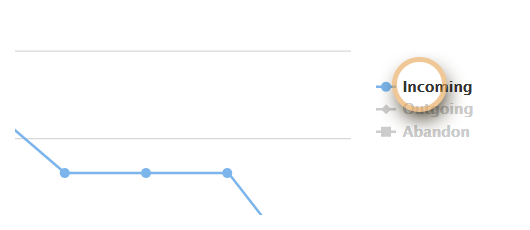
7. By clicking on the title of the graphs on the right side, you can toggle their visibility on and off.
There are 9 scaled-up charts with different purposes on PBXDom. Here, you can read more about them as it follows:
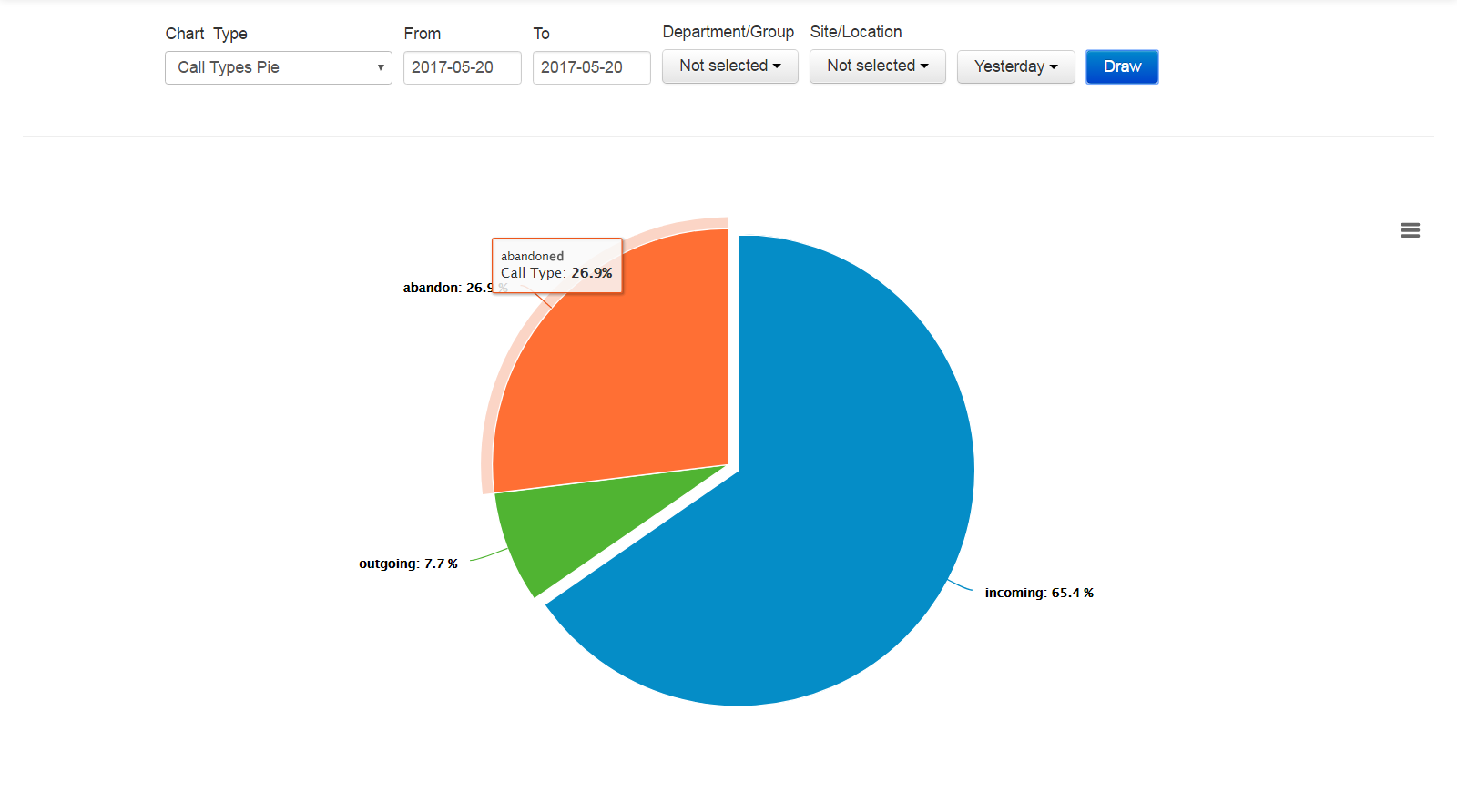
Call Types Pie chart is a way of displaying the total number of incoming, outgoing, and abandoned calls in percentage using a pie chart. This chart has only three slices with three different colors as blue for incoming calls, green for outgoing calls, and orange for abandoned.
This line chart shows us the number of incoming, outgoing, and abandoned calls on an hourly basis using three continual line graphs with colors blue, black, and green. Call Traffic 24 Hours graph has two vertical and horizontal axes.
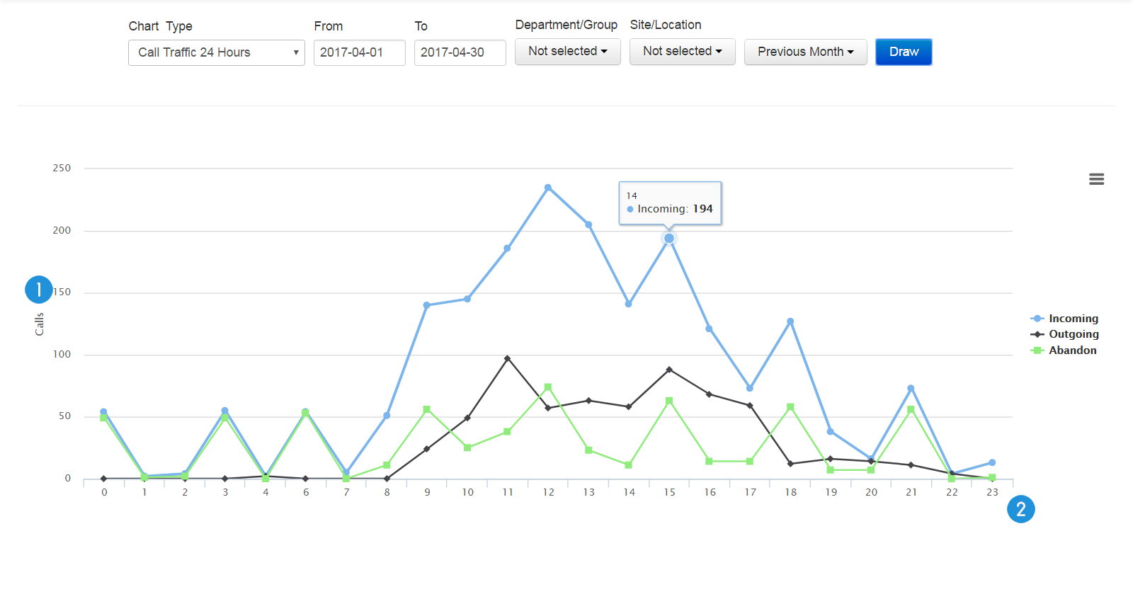
1. Vertical axis: total number of the calls at a certain hour can be defined on the vertical axis.
2. Horizontal axis: hours are scattered across the horizontal axis.
Trunk Utilization shows the total number of incoming, outgoing, and abandoned calls of each landline using a bar chart. This chart consists of two vertical and horizontal axes.
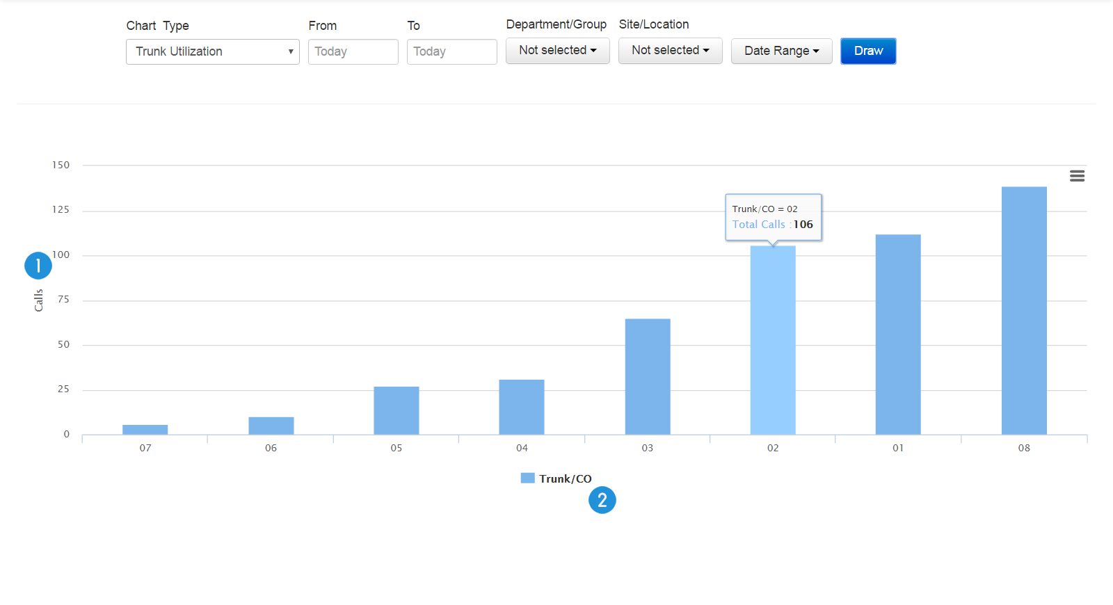
1. Vertical axis: the vertical axis shows the total number of incoming, outgoing, and abandoned calls of each landline.
2. Horizontal axis: the horizontal axis shows all the landlines plugged into your PBX.
Note: Trunk, CO, and landline are the equivalents of each other and can be used interchangeably.
This line graph presents the number of incoming, outgoing, and abandoned calls on the daily basis using several continual line graphs with colors blue for incoming, black for outgoing, and green for abandoned calls. Call Traffic by Days has two axes.
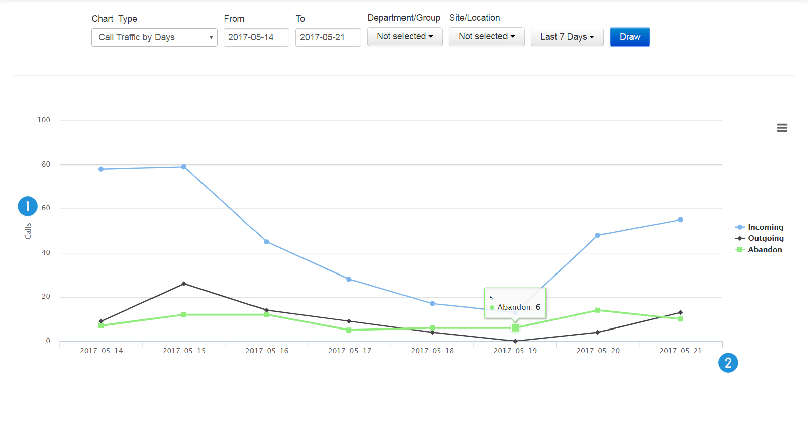
1. Vertical axis: number of the calls on a specific day/date can be defined on the vertical axis.
2. Horizontal axis: days are scattered across the horizontal axis.
This line chart shows us the total duration of all the incoming, and outgoing calls on an hourly basis using three continual line graphs with colors blue, black, and green.
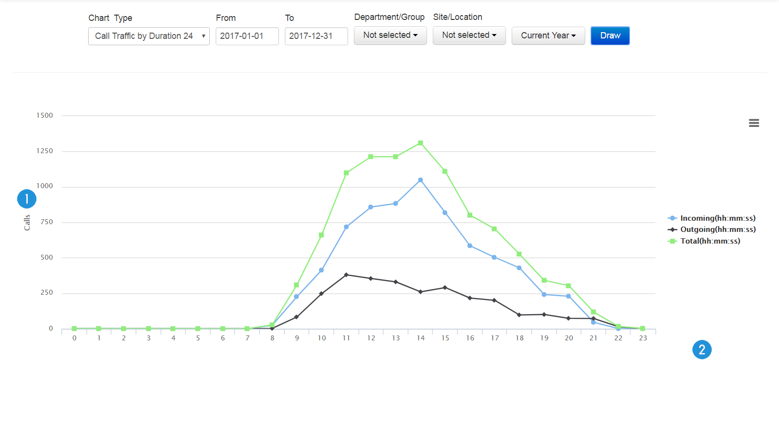
1. Calls: the total duration of all the incoming, or outgoing calls in minutes
2. Hours: twenty-four hours of a day are all scattered across the horizontal axis
This line chart shows us the total duration of all the incoming, and outgoing calls on a daily basis using three continual line graphs with colors blue, black, and green.
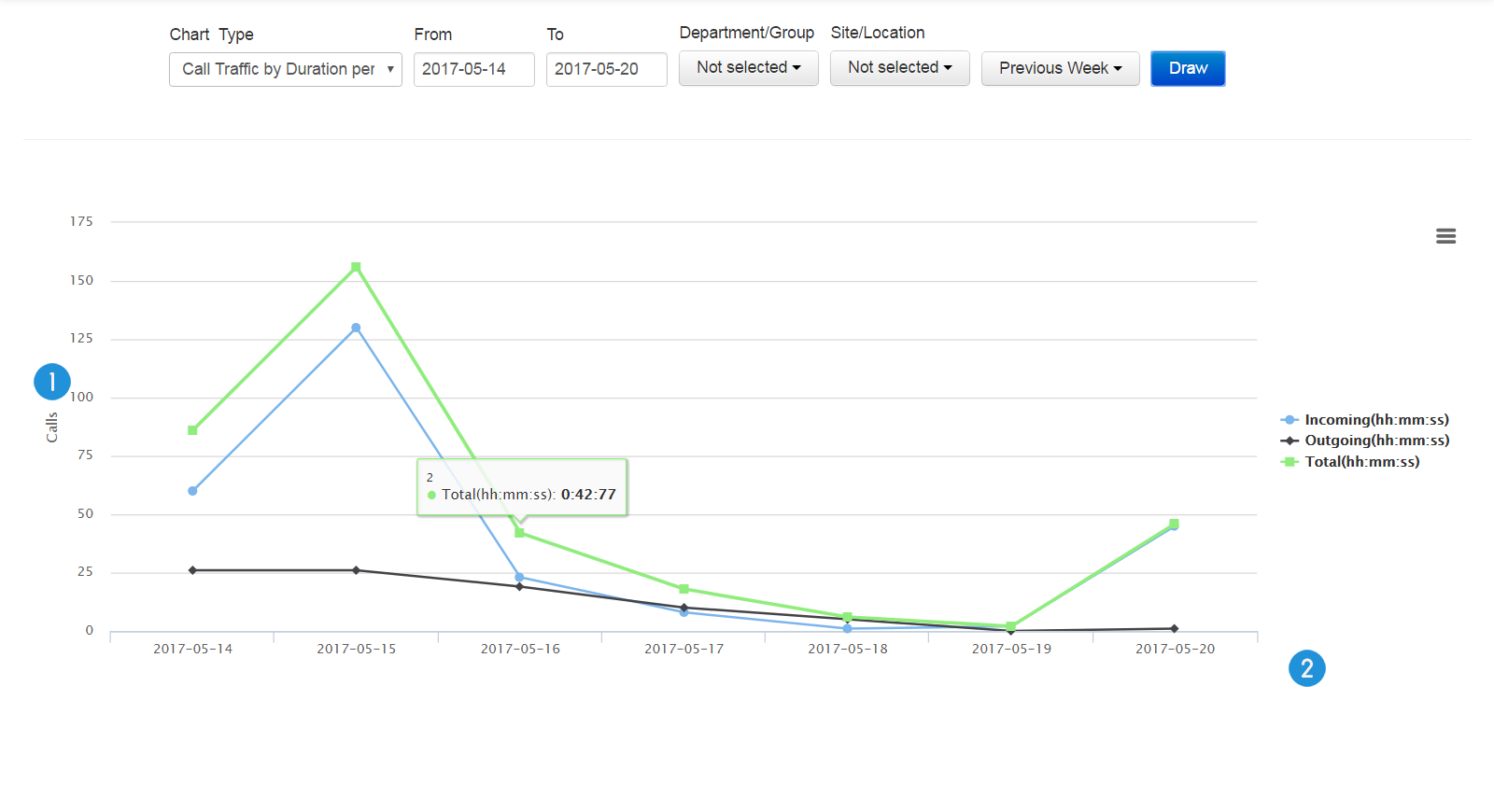
1. Calls: the total duration of all the incoming, and outgoing calls
2. Days: days are scattered across the horizontal axis.
This line graph shows all the concurrent calls based on the seconds.
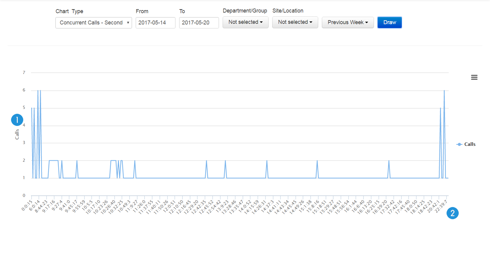
1. Calls: the number of concurrent calls
2. Timeline: time which is based on the seconds
Tip: this line graph helps managers to learn about and evaluate their landline needs, and decide better if it is necessary to increase up the number of them or not.
This line graph shows all the concurrent calls based on the minutes.
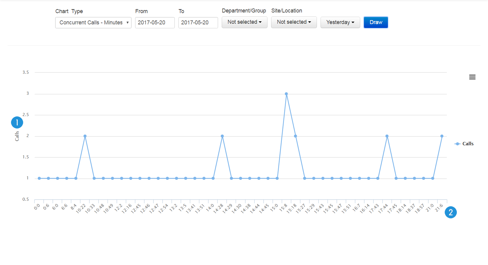
1. Calls: the number of concurrent calls
2. Timeline: time which is based on the minutes
Tip: this line graph helps managers to learn about and evaluate their landline needs, and decide better if it is necessary to increase up the number of them or not.
This line graph shows all the concurrent calls based on the hours.
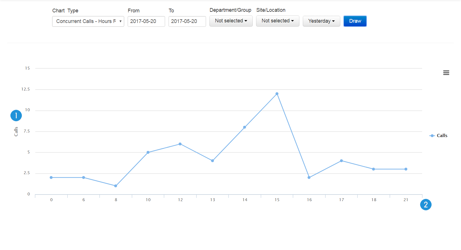
1. Calls: the number of concurrent calls
2. Timeline: time which is based on the hours
Tip: this line graph helps managers to learn about and evaluate their landline needs, and decide better if it is necessary to increase up the number of them or not.

